
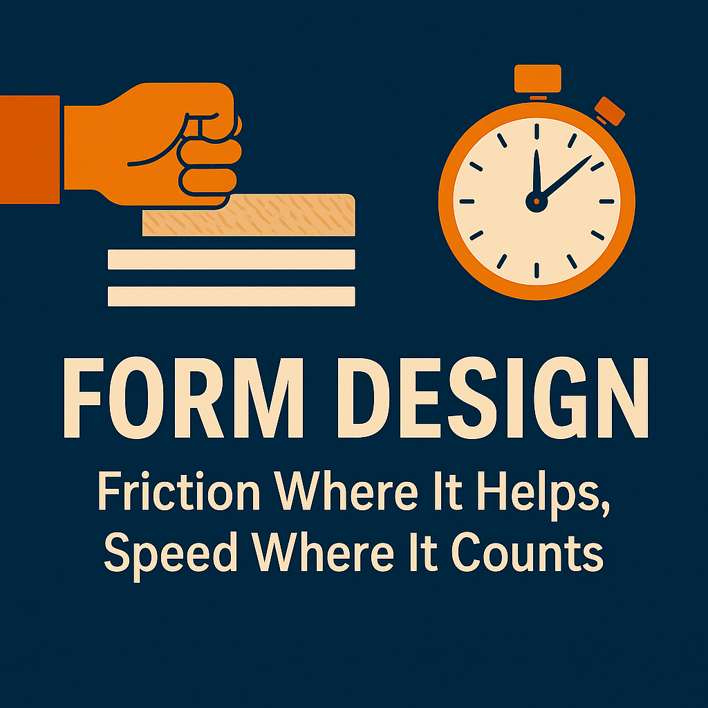
Forms are the unsung heroes of digital growth. They sit at the junction between interest and conversion—between a click and a lead, a signup, or a sale. Yet, too often, forms are treated as an afterthought, slapped onto landing pages with little regard for psychology, usability, or strategy.
The truth is: form design is not just about reducing friction. It’s about knowing where friction helps and where speed is non-negotiable. The most effective digital experiences don’t simply minimize clicks—they guide users toward decisions that benefit both sides of the exchange.
The Paradox of Friction
Marketers often think of friction as inherently bad. After all, fewer fields mean higher completion rates, right? That’s not always the case.
- Helpful friction builds commitment. Asking a qualifying question in a B2B form—such as company size or budget range—can prime the prospect for the conversation ahead, filtering out low-quality leads.
- Micro-friction signals seriousness. A two-step signup (email first, then profile) can reduce spam entries and ensure users are invested.
- Cognitive effort creates perceived value. When users fill in thoughtful details, they feel they’re tailoring the experience—making the result seem more valuable.
In short: friction, when designed purposefully, raises lead quality and creates buy-in.
Where Speed is Non-Negotiable
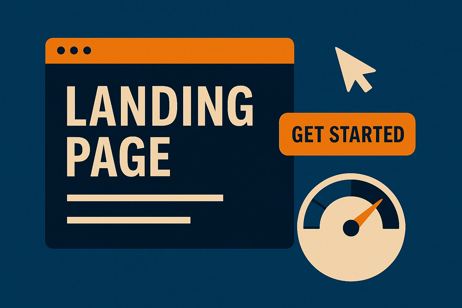
But in other contexts, friction kills momentum. For high-intent users, every extra step introduces abandonment risk.
- E-commerce checkout: Customers want to buy, not fill out surveys. Autofill, guest checkout, and wallet integrations (Apple Pay, Google Pay) are essential.
- Lead capture at peak interest: If someone clicks a time-sensitive ad or limited offer, the form should ask for the bare minimum: usually name + email.
- Mobile-first flows: On small screens, long forms with multiple taps are deal-breakers.
Here, speed is the difference between capitalizing on intent and losing it forever.
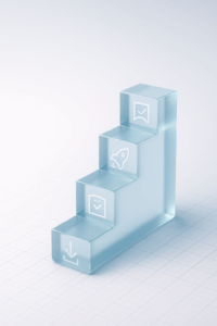
Balancing Friction and Speed
The art of form design lies in striking the right balance for the goal, audience, and stage of the funnel.
- Top-of-funnel (awareness): Prioritize speed. A simple newsletter signup should be frictionless—just one field, maybe two.
- Mid-funnel (consideration): Introduce selective friction. Demo requests or gated whitepapers can use 4–5 fields to pre-qualify leads.
- Bottom-of-funnel (decision): Allow purposeful depth. A detailed onboarding form can feel appropriate if the user has already invested.
This staged approach ensures you capture volume at the top without overwhelming, while still creating checkpoints where quality matters most.
Design Principles That Work
- Progressive disclosure: Instead of a long form upfront, reveal additional questions step by step. Users are more likely to complete what they’ve started.
- Contextual cues: Use microcopy to explain why you’re asking for information (“We ask for company size to connect you with the right rep”).
- Smart defaults & autofill: Reduce effort without reducing data quality.
- Visual simplicity: White space, clear labels, and large clickable fields matter more than flashy design.
- Feedback loops: Inline validation (green checkmarks, error hints) removes uncertainty in real time.
Measuring Form Performance
To optimize forms, you can’t rely on assumptions. Analytics should cover:
- Completion rate by field (where drop-offs happen)
- Time to complete (across devices)
- Lead quality vs. form length (quantity vs. quality tradeoff)
- A/B testing friction points (e.g., one-step vs. two-step flows)
With data, you can pinpoint exactly which friction adds value—and which erodes it.
Conclusion
Form design isn’t about removing friction altogether. It’s about placing it where it helps and removing it where it hurts. The best forms feel natural: fast where speed matters, and intentional where commitment improves outcomes.
Businesses that master this balance don’t just improve conversion rates—they build pipelines of higher-quality leads, stronger customer trust, and smoother digital journeys.
In the world of digital growth, the form isn’t the end of the journey. It’s the beginning of a relationship. Design it with care.


Add comment