
A pricing page is not a rate card—it’s a decision engine. Visitors arrive with uncertainty, hidden objections, and half-formed mental models of value. Your job is to transform ambiguity into confident action using three controllable levers: anchors (how value is framed), toggles (how options map to needs), and risk reversal (how fear is removed). Treated scientifically, these levers compound into higher trials, higher ASP, and fewer support escalations.
1) Anchors: Set the Frame Before the Price
Anchoring is the cognitive shortcut buyers use to evaluate numbers. If the first thing they see is a high but justifiable reference, everything else looks more reasonable.
Practical anchors
- Plan order & emphasis: Lead with the recommended plan (usually the middle) and present a higher-tier reference first in the comparison table.
- Value math: Translate abstract features into concrete outcomes: “Replace 5 tools → save ~$186/month” or “Automates ~12 hrs/wk.”
- Social anchors: “Chosen by 63% of teams like yours.” Normalize the target plan.
- Decoys: A purposely inferior plan close in price to the target plan makes the target look like a deal (use sparingly; ensure ethical clarity).
- Competitor context (lightweight): A small line like “Comparable tools: $X–$Y” frames expectations without starting a feature war.
Do
- Put the annual reference above monthly: “$79/mo billed annually ($948/yr)” with a small “Save 17%” badge.
- Pair price with one outcome metric (time saved, seats covered, throughput).
Don’t
- Lead with discounts unrelated to value. First earn belief; then show savings.
2) Toggles: Let Buyers Configure Without Confusion
Toggles convert complexity into clarity. They help buyers self-identify and predict cost.
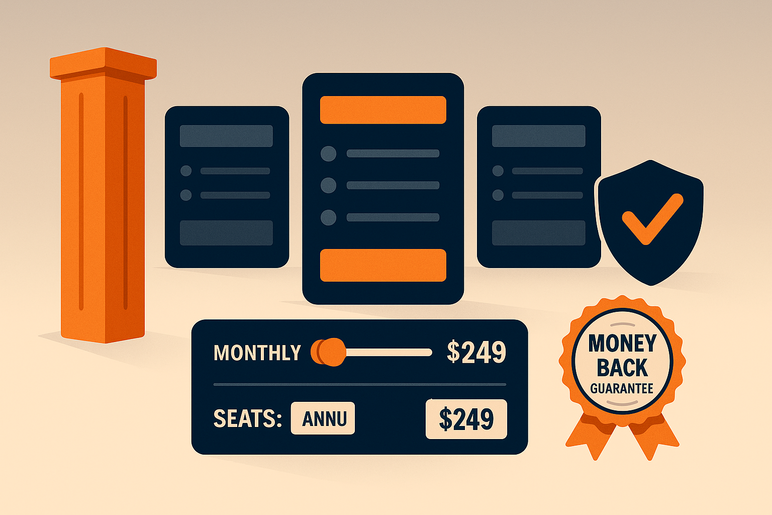
Essential toggles
- Billing cycle: Monthly ↔ Annual. Keep the toggle persistent across plans.
- Seats/usage sliders: Show live price updates. Make tiers snap to known breakpoints (e.g., 5, 10, 25 seats).
- Addon switches: Advanced analytics, SSO, priority support—each with a one-line benefit and micro-tooltip.
Design rules
- Reflect ICPs, not spreadsheet logic. If you sell to startups and mid-market, structure SKUs around jobs-to-be-done, not internal packaging constraints.
- Keep cognitive load low: one primary toggle per row; additional options tucked into a clean “Customize” drawer.
- Real-time math: update Total, Per-Seat, and Estimated Annual with each change.
- Accessibility & trust: show tax/fees policy and currency early; don’t move totals below the fold.
Testing ideas
- Default-to-annual vs. default-to-monthly.
- Seat slider default (2 vs. 5).
- “Try first” vs. “Book demo” CTAs by segment.
3) Risk Reversal: Remove the Fear That Blocks Action
Most pricing hesitation isn’t math—it’s risk. Risk reversal makes the first step feel safe.
High-leverage patterns
- Free trial with success path: 14 days plus a 4-step checklist in-app and in email.
- Live sandbox or interactive demo: Let users click through real data without commitment.
- Guarantee with constraints: “30-day money back if we don’t improve X by Y% with recommended setup.”
- Roll-off clauses: “Start with 10 seats; scale down within 30 days at the same rate.”
- Security & compliance proofs: SOC 2, ISO, GDPR, SSO—place above the fold for enterprise traffic.
- Proof density: Logos, short quantified wins, and 20–30 second video testimonial clips.
Sales-assist cues
- “Complex billing? Talk to pricing.” Route high-intent visitors to a human at the moment of doubt.
Page Architecture: A Wireframe You Can Ship
Above the fold
- Plan cards (3–4 max) with clear JTBD names (Starter, Growth, Scale, Enterprise).
- Billing toggle (Monthly/Annual) + “Save X% annually” callout.
- Primary CTA per plan (Try free / Start now) and Secondary CTA (Talk to sales) for mid/high tiers.
- Trust row (badges, SOC2, uptime, money-back icon).
Middle section
- Feature comparison grouped by outcomes (Automation, Collaboration, Governance).
- Seat/usage slider that updates each plan’s price in place.
- Add-ons with one-line “why it matters.”
Below the fold
- Proof wall: 3 quantified wins, 6–8 logos, 1 mini-case (100 words).
- FAQ built for objections: Contracts, prorations, data export, security.
- Compliance & SLA links (deep docs for procurement).
Metrics That Matter (and How to Instrument)
- Plan mix (%): share of sign-ups by tier; target a healthy middle.
- ARPA / ASP: average revenue per account / sale; track shifts after experiments.
- Trial start rate and trial→paid by entry plan.
- Toggle engagement: % of visitors using annual toggle, slider interactions/session.
- Time to first value for trialers (hours to key event).
- Refund/chargeback rate post risk-reversal changes.
- Enterprise contact rate from pricing (clicks on “Talk to sales”).
Implement event tracking (e.g., pricing_toggle_change, slider_adjust, addon_expand, cta_click) and tie to downstream revenue, not just CTR.
Experiment Roadmap (4 Weeks)
Week 1 — Anchor pass
- Introduce a data-backed value statement atop cards.
- Reorder plans; add a subtle decoy near the target plan.
Week 2 — Toggle clarity
- Persistent billing toggle; add live total math.
- Add seat slider snapping to common breakpoints.
Week 3 — Risk reversal
- Launch money-back + sandbox demo; add security row above the fold.
- Create an objection-led FAQ.
Week 4 — Proof density
- Ship mini-case with before/after numbers; add 6 fresh logos.
- Evaluate ARPA lift and trial→paid deltas; keep the winners.
Anti-Patterns to Avoid
- Too many plans (decision paralysis).
- Hiding enterprise (forces inbox ping-pong).
- Math surprises (fees revealed at checkout).
- Decorative feature lists (group by outcomes, not nouns).
- “Contact us” everywhere (gate only where complexity truly demands it).
Final Thought
Pricing pages don’t persuade with price alone. They persuade by framing value (anchors), giving control (toggles), and eliminating fear (risk reversal). Treat these as scientific variables—measured, iterated, and tied to revenue—and your pricing page stops being a brochure and becomes a growth machine.


Add comment