
Accessibility and aesthetics are not trade-offs—they’re multipliers. Interfaces that respect human limits (vision, motion sensitivity, cognition) look calmer, feel more premium, and convert better. This SpectrumMediaLabs playbook shows how to design for WCAG-level accessibility without diluting brand voice. It’s practical: tokens, ratios, layout rules, motion defaults, form patterns, and QA checklists you can ship today.
North-star principles
- Aesthetics = hierarchy + rhythm, not just color. Great visual design leans on spacing, type scale, and composition—elements that are inherently accessible.
- Semantics first, styling second. If the structure is right (real buttons, real lists, labeled inputs), assistive tech will work and visuals can safely evolve.
- Progressive enhancement. Provide a solid, readable default; layer richer visuals and motion when the device and user preferences allow.
- Test with constraints. Zoom to 200%, tab through with a keyboard, turn on reduced motion, and view in sunlight. If it still feels premium, you nailed it.
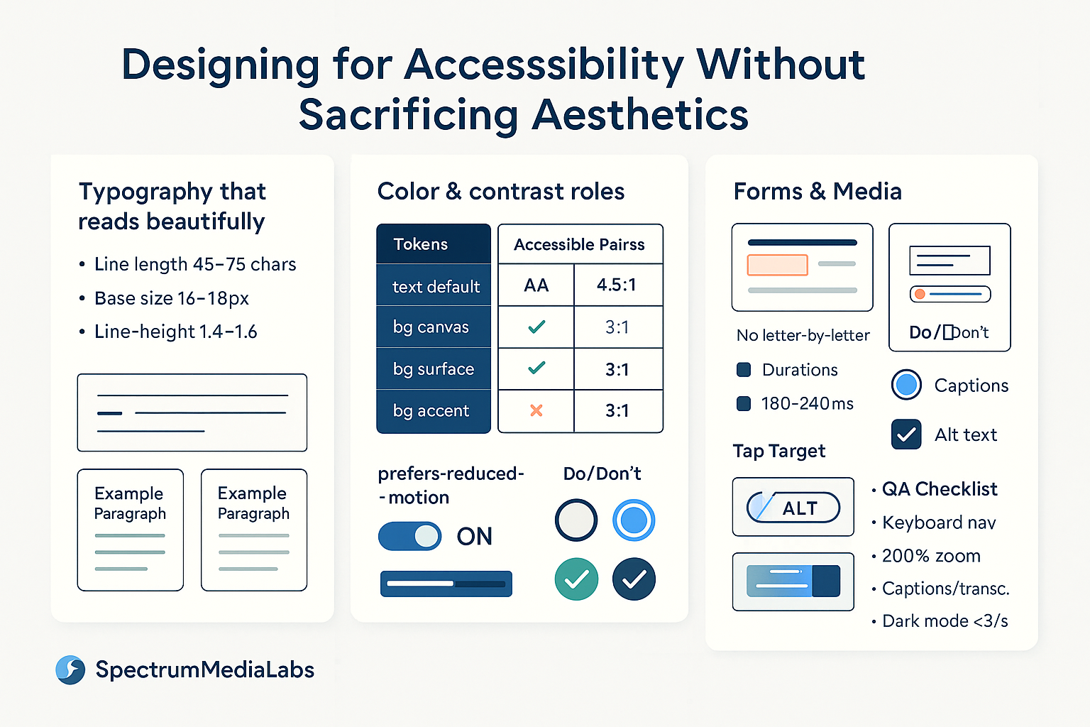
Type that reads beautifully (and passes)
- Line length: 45–75 characters for body text; 28–45 on mobile.
- Line height: 1.4–1.6 for paragraphs; 1.2–1.3 for headings.
- Size: Base 16–18 px; never lock body copy below 16. Scale headings with a modular scale (e.g., 1.25).
- Weight: Use weight and size—not all caps—for hierarchy. If you must use caps, add letter-spacing (0.04–0.08em).
- Contrast:
- Normal text: ≥ 4.5:1 (AA)
- Large text (≥ 24 px regular or 18.66 px bold): ≥ 3:1
- Don’t animate letter-spacing, line-height, or weight. Use opacity/translate for motion (if any).
Aesthetic tip: generous leading and consistent paragraph spacing (e.g., margin-top = 0.75 × line-height) create a “magazine” feel while improving readability.
Color systems that stay on-brand and pass
Design your palette around roles instead of hex codes.
Color roles (tokens)
text.default,text.muted,text.onAccentbg.canvas,bg.surface,bg.subtle,bg.accentborder.default,border.focusstatus.success/warn/error(text + surface + border triplets)
Accessible pairs map
Create a table of approved pairings with pre-verified contrast:
| Foreground → Background | canvas | surface | accent | success | warn | error |
|---|---|---|---|---|---|---|
| text.default | ✅ 7.0:1 | ✅ 6.4:1 | ❌ 2.0:1 | ✅ 4.6:1 | ✅ 4.7:1 | ✅ 5.1:1 |
| text.onAccent | — | — | ✅ 5.2:1 | — | — | — |
Only allow combinations present in this map inside your design library.
Dark mode that looks premium
- Use near-black (e.g.,
#0E0E12) not pure black for backgrounds; lift surfaces by 3–6% to create depth. - Increase text size or weight by one step in dark mode and avoid saturated pure colors on dark (they vibrate).
- Keep focus rings and error states bright enough (≥ 3:1 against the element, ≥ 4.5:1 against the adjacent background).
Layout & spacing: elegance through structure
- Grid: 4- or 8-pt spacing; align type baselines to multiples for rhythm.
- Density: target ~60–70% white space on content screens; tight does not mean premium.
- Hit targets: interactive elements ≥ 44 × 44 px with at least 8 px spacing.
- Containers: increase surface elevation via contrast and shadow or via border + subtle tint—not both.
- Overflow: avoid text over busy imagery; if needed, add a 12–20% scrim behind type.
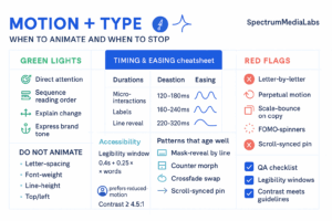
Motion & state changes (beauty without nausea)
- Respect
prefers-reduced-motion; provide a static preset or cut durations by 80–100%. - Default durations: 180–240 ms for small UI, 240–320 ms for page/section transitions.
- Ease curves:
cubic-bezier(0.2,0.8,0.2,1)in;cubic-bezier(0.33,0,0.67,1)out. - Keep moving type to line-reveal (not letter-reveal); hold still for the legibility window (~
0.4s + 0.25s × words). - Avoid parallax beyond 8 px and any flashing faster than 3/s.
Forms that feel refined and are bulletproof
- Labels always visible. Placeholder ≠ label. Float labels only if they remain readable at 200% zoom.
- Input affordance: borders with 3:1 contrast minimum; fill/tint alone is ambiguous.
- Focus states: a 2–3 px ring that contrasts with the element and background (often a dual ring: light outer, dark inner).
- Error states: don’t rely on color; add icon + helper text (
aria-describedby). - Help text: reserve space so layout doesn’t jump on error.
- Touch keyboards: set
inputmode/type(email,tel,numeric) to reduce friction.
Components: semantic + styled
- Buttons vs links: use
<button>for actions,<a>for navigation. Style either way, but keep semantics. - Icons: add an accessible label if the icon stands alone (
aria-label="Download"). If paired with text, mark the iconaria-hidden="true". - Disclosure/accordions: use
<button aria-expanded="…">+aria-controls. Animate height withmax-heightor transform, but keep content readable with motion disabled. - Modals: trap focus, restore focus on close, allow
Escto dismiss, and avoid background scroll.
Media: images, video, and alternatives
- Alt text: describe purpose, not pixels. Decorative images should be
alt="". - Captions: required for videos; transcripts for long audio.
- Auto-play: muted only; provide controls immediately.
- Overlay text on imagery: add scrim and ensure ≥ 4.5:1; lock a minimum text size (≥ 16 px).
- Charts: provide data tables or summary descriptions; differentiate series by shape/pattern as well as color.
Code snippets you can paste
Reduced motion & focus
/* Respect user preference */
@media (prefers-reduced-motion: reduce) {
  * { animation: none !important; transition: none !important; }
}

/* Beautiful, visible focus */
:where(button, a, input, select, textarea):focus-visible {
  outline: none;
  box-shadow:
    0 0 0 3px var(--focus-outer),
    0 0 0 1px var(--focus-inner) inset;
  border-radius: 10px;
}
Visually hidden utility (screen-reader only)
.visually-hidden {
  position: absolute !important;
  height: 1px; width: 1px;
  overflow: hidden; clip: rect(1px,1px,1px,1px);
  white-space: nowrap; border: 0; padding: 0; margin: -1px;
}
Tokenized color roles
:root {
  --bg-canvas:#FFFFFF; --bg-surface:#F7F8FA;
  --text-default:#0E1220; --text-muted:#606B85;
  --accent:#2C46FF; --text-onAccent:#FFFFFF;
  --focus-outer:#BFD2FF; --focus-inner:#2C46FF;
  --error:#D92D20; --success:#15B79E; --warn:#F79009;
}
Designing in Figma without losing taste
- Create Text Styles and Color Styles named by role (not hex).
- Use a contrast plugin and lock styles that fall below AA.
- Build components with variants for focus/hover/disabled; never detach to “tweak just this once.”
- Add anatomy annotations (label, helper, error, hint) so engineers map props correctly.
- Include a Reduced Motion preview page that shows static fallbacks.
Accessibility QA that doesn’t kill velocity
Automated
- Lint with Axe/Lighthouse in CI; block merges on criticals.
- Snapshot contrast pairs; fail builds if tokens regress.
Manual (30–40 minutes)
- Keyboard-only sweep (Tab/Shift+Tab, Space/Enter, Esc).
- Screen reader spot check (NVDA/VoiceOver): nav, menu, one form, one modal.
- Zoom to 200%; ensure nothing essential is clipped.
- Simulate color-blindness; check error and focus states.
Operational metric: track A11y debt = (open issues labeled a11y × severity points). Trend should fall sprint-over-sprint.
Common myths, punctured
- “Accessible means boring.” True minimalism uses type scale, spacing, and composition—hallmarks of premium brands.
- “High contrast ruins our palette.” Not if you use role-based tokens and subtle surfaces; the accent can stay vibrant while text remains legible.
- “We’ll add accessibility later.” Retrofitting costs 5–10× more and looks worse. Build it into your components once.
30/60/90 roll-out for SpectrumMediaLabs
Days 1–30 — Foundations
- Define role-based tokens and a contrast-verified pairs map.
- Add focus, hover, disabled states to core components.
- Ship
prefers-reduced-motionand a visible focus ring across the site.
Days 31–60 — Components & Content
- Refactor forms (labels, hints, errors,
aria-ties). - Caption all hero videos; add transcript support.
- Add a11y checks to CI; set a baseline debt metric.
Days 61–90 — Scale & Aesthetics
- Dark mode with near-black surfaces and tuned type scale.
- Audit imagery overlays; introduce scrim rules + minimum sizes.
- Publish a one-page Aesthetic & Accessibility Guide (type scale, spacing, motion defaults, color pairs).
Ship-ready checklists
Design review
- Text/body ≥ 16 px; headings use scale, not caps
- Contrast AA (4.5:1 normal, 3:1 large) across states
- Interactive 44×44 px; consistent spacing rhythm
- No text over busy imagery without scrim
- Motion respects reduced-motion; no parallax > 8 px
Build review
- Real buttons/links with discernible names
- Focus visible and trapped correctly in modals
- Labels,
aria-describedbyfor errors/hints - Captions/transcripts for media
- Keyboard complete: all actions possible without a mouse
Bottom line
Accessibility isn’t a constraint on aesthetics—it’s a design discipline that clarifies hierarchy, calms layouts, and earns trust. By leaning on type, space, and structured color; by respecting motion preferences; and by baking semantics into components, SpectrumMediaLabs can deliver interfaces that feel more premium precisely because they’re easier for more people to use.

Add comment